Back to UIKit for fluid scrolling
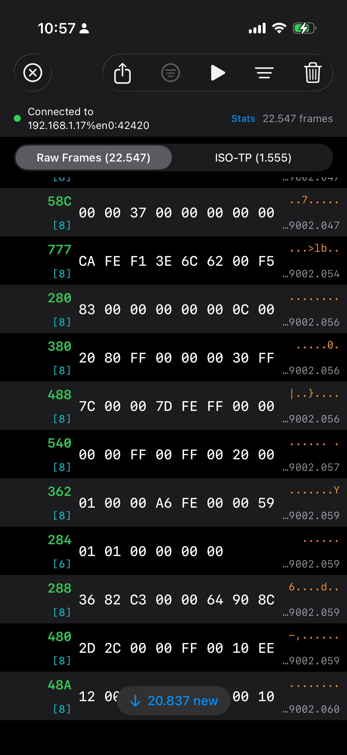
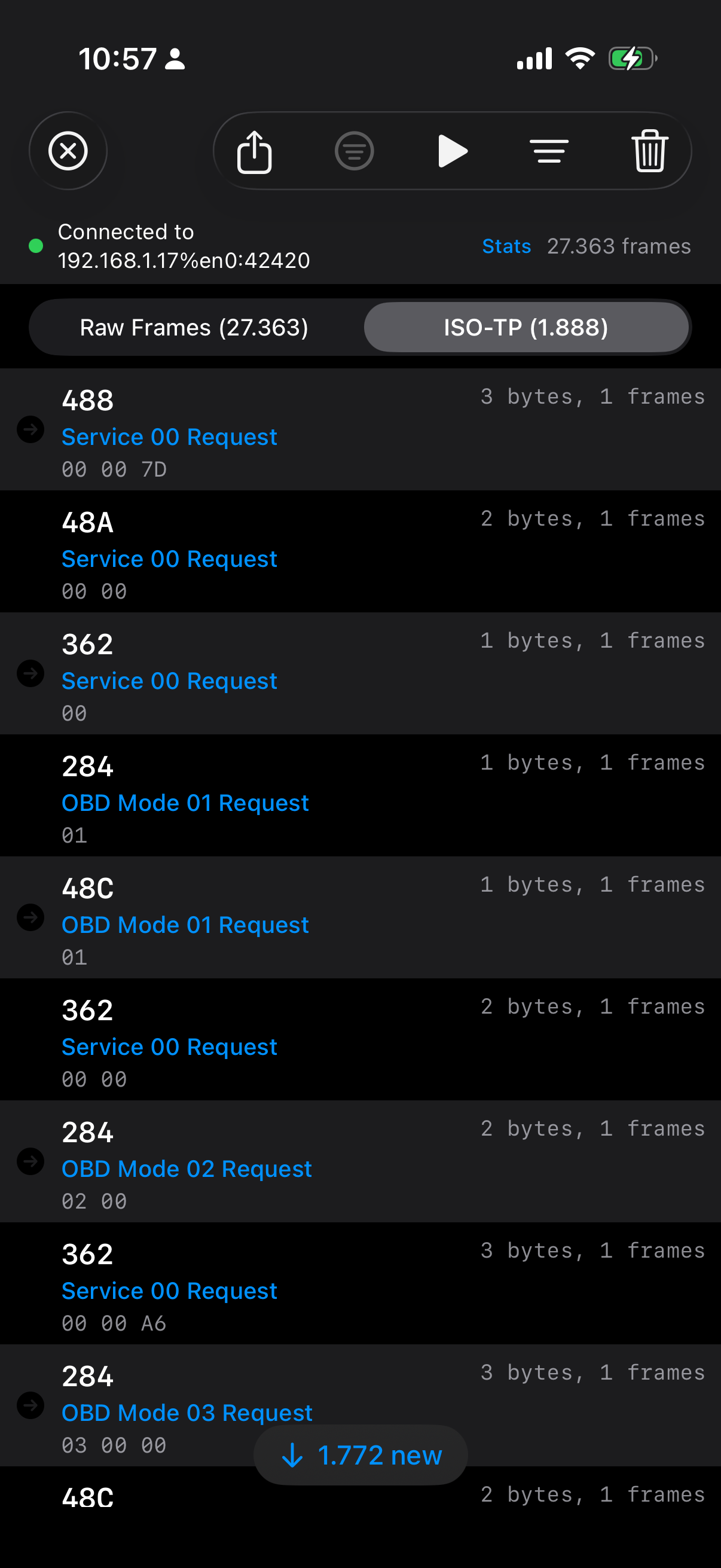
I have spent the last couple of days optimizing the iPhone companion app for CANcorder (forthcoming), my CAN bus logger and analyzer. The original iOS frontend was written in SwiftUI, which made it wonderfully quick to build and iterate on. For modest amounts of data, it was fine. But “modest” is not what CAN traffic looks like in the real world. Once I attached an ECU that happily sprayed roughly 700 frames per second, the app started to tell a very old story again: pretty abstractions are no substitute for ruthless control over the hot path.
What surprised me is not that SwiftUI eventually hit a wall. What surprised me is where the big win came from. Moving from SwiftUI to UIKit was already worthwhile, but the really major step towards fluid scrolling on modern iPhones came only after going one step further: skipping stack views, skipping Auto Layout, and drawing the rows by hand.
Yes, even on today’s ridiculously powerful devices.
SwiftUI is excellent until it is not
SwiftUI is fantastic for the 90% case. If your list has a few hundred rows, occasional updates, and a reasonably static layout, I would still pick it first. The API is productive, state propagation is elegant, previews are pleasant, and you can ship features very quickly.
But a live log viewer with tens of thousands of rows is not the 90% case.
My first implementation used a SwiftUI list-like hierarchy. It worked, but it did too much work on every update: view diffing, text layout, filter recomputation, derived state rebuilding, and all the other little conveniences that feel cheap when the data set is small. Once the frame count climbed into the tens of thousands, scrolling became choppy. Around the six-figure mark, it was obvious that this was not the right tool for the job.
The first refactoring was predictable: move parsing, ISO-TP decoding, filtering, and export work off the main thread. That helped, and it was necessary anyway. But it still did not feel right. The UI was better, not fluid.
UIKit was necessary, but not sufficient
The next step was replacing the SwiftUI row hierarchy with UITableView. That alone already cut a lot of overhead. Cell reuse is still a wonderfully boring and effective idea. There is a reason it has survived so many framework cycles.
However, my first UIKit version was still far from optimal. The cells used UILabel, UIImageView, UIStackView, and constraints. In other words, I had merely replaced one high-level layout system with another slightly older one. This version was better than SwiftUI, yes, but under sustained live ingest it still felt heavier than it should.
This is the version that looked correct on paper:
private final class IsoTpTableCell: UITableViewCell {
    private let iconView = UIImageView()
    private let idLabel = UILabel()
    private let metaLabel = UILabel()
    private let hintLabel = UILabel()
    private let dataLabel = UILabel()

    override init(style: UITableViewCell.CellStyle, reuseIdentifier: String?) {
        super.init(style: style, reuseIdentifier: reuseIdentifier)

        let topRow = UIStackView(arrangedSubviews: [idLabel, UIView(), metaLabel])
        topRow.axis = .horizontal

        let textStack = UIStackView(arrangedSubviews: [topRow, hintLabel, dataLabel])
        textStack.axis = .vertical
        textStack.spacing = 2
        textStack.translatesAutoresizingMaskIntoConstraints = false

        contentView.addSubview(iconView)
        contentView.addSubview(textStack)

        NSLayoutConstraint.activate([
            iconView.leadingAnchor.constraint(equalTo: contentView.layoutMarginsGuide.leadingAnchor),
            textStack.leadingAnchor.constraint(equalTo: iconView.trailingAnchor, constant: 10),
            textStack.trailingAnchor.constraint(equalTo: contentView.layoutMarginsGuide.trailingAnchor),
        ])
    }
}
There is nothing wrong with that code. In fact, for most apps it is perfectly reasonable. But when you want to scroll through 10,000 or 100,000 rows while ingesting live data, every one of those conveniences has a cost. Constraints need solving, views need layout, labels need text measurement, and the cell tree is much larger than the pixels you actually need to paint.
The major step was getting rid of layout machinery
The real breakthrough came when I stopped asking UIKit to build and lay out a mini view hierarchy for every visible row.
Instead, each reusable cell now hosts a tiny canvas view. That canvas measures the available width once per width bucket, chooses the largest monospaced font size that still guarantees visibility of all eight CAN data bytes, and draws the text directly.
No labels. No stack views. No constraints. No Auto Layout.
private final class FrameTableCell: UITableViewCell {
    private let canvasView = FrameRowCanvasView()

    override init(style: UITableViewCell.CellStyle, reuseIdentifier: String?) {
        super.init(style: style, reuseIdentifier: reuseIdentifier)
        selectionStyle = .none
        contentView.addSubview(canvasView)
        canvasView.autoresizingMask = [.flexibleWidth, .flexibleHeight]
    }

    override func layoutSubviews() {
        super.layoutSubviews()
        canvasView.frame = contentView.bounds
    }
}
And the actual row rendering is little more than measured rectangles and direct drawing:
override func draw(_ rect: CGRect) {
    guard let frameModel else { return }

    let metrics = Self.metrics(for: bounds.width)
    let contentRect = bounds.insetBy(dx: 8, dy: 6)

    let idRect = CGRect(x: contentRect.minX, y: contentRect.minY,
                        width: metrics.leftColumnWidth, height: metrics.idFont.lineHeight)

    let dataRect = CGRect(x: contentRect.minX + metrics.leftColumnWidth + 8,
                          y: contentRect.midY - metrics.dataFont.lineHeight / 2,
                          width: metrics.dataColumnWidth,
                          height: metrics.dataFont.lineHeight)

    frameModel.formattedId.draw(in: idRect, withAttributes: idAttributes)
    frameModel.visibleDataText.draw(in: dataRect, withAttributes: dataAttributes)
}
The font fitting is similarly simple and similarly important:
private static func metrics(for width: CGFloat) -> LayoutMetrics {
    let availableWidth = max(0, width - 16)
    let template = "00 00 00 00 00 00 00 00"

    var size: CGFloat = 16
    while size >= 10 {
        let dataFont = UIFont.monospacedSystemFont(ofSize: size, weight: .medium)
        let dataWidth = ceil((template as NSString).size(withAttributes: [.font: dataFont]).width)

        if dataWidth <= availableWidth {
            return LayoutMetrics(dataFont: dataFont, dataColumnWidth: dataWidth)
        }
        size -= 0.5
    }

    return LayoutMetrics(dataFont: .monospacedSystemFont(ofSize: 10, weight: .medium),
                         dataColumnWidth: 150)
}
This may look primitive compared to SwiftUI’s declarative charm, but that is precisely the point: primitive code leaves less work for the runtime.
The other half: only UI on the main thread
There is another rule that became non-negotiable during this exercise: the main thread should do UI, and only UI. Not “mostly UI”. Not “UI plus a little convenience formatting”. UI.
That means:
- TCP receive off the main thread
- CAN frame parsing off the main thread
- ISO-TP decoding off the main thread
- filtering off the main thread
- CSV export off the main thread
- row string precomputation off the main thread
By the time the table view sees a row model, the expensive work is already done. The cell should not need to wonder how to turn bytes into text or whether a frame is interesting. It should just paint the answer.
The row model now comes prepared:
struct CANFrame: Identifiable, Equatable, Sendable {
    let formattedId: String
    let visibleDataText: String
    let asciiPreviewText: String
    let shortTimestamp: String

    init(index: Int, timestamp: UInt64, canId: UInt32, extended: Bool, dlc: UInt8, data: [UInt8]) {
        self.formattedId = extended ? String(format: "%08X", canId) : String(format: "%03X", canId)
        self.visibleDataText = data.prefix(8).map { String(format: "%02X", $0) }.joined(separator: " ")
        self.asciiPreviewText = String(data.prefix(8).map { $0 >= 0x20 && $0 < 0x7F ? Character(UnicodeScalar($0)) : "." }.prefix(8))
        self.shortTimestamp = String(format: "%.3f", Double(timestamp) / 1_000_000.0)
    }
}
Again, none of this is intellectually sophisticated. It is just disciplined.
Modern hardware does not save wasteful UI code
It is tempting to believe that an A‑series iPhone chip should brute-force its way through anything. And indeed, modern devices hide a multitude of sins. But they do not repeal the laws of software physics. If you ask the framework to solve constraints, diff view trees, measure text repeatedly, allocate too many subviews, and do too much work during rapid updates, you will still pay for it.
The key lesson here is that UI performance is not usually lost in one dramatic mistake. It leaks away in death by a thousand abstractions. Each one seems harmless. Together they turn “should feel instant” into “why is this slightly sticky?”
And when you strip those abstractions away, the result can be almost embarrassingly better.
Conclusion
I still like SwiftUI. I will continue to use SwiftUI for many parts of iOS apps, because the productivity gains are real and often worth the tradeoff. But for high-frequency, very large, log-style interfaces on the iPhone, I am now more convinced than ever that going back to UIKit is only half the journey. The major step towards truly fluid scrolling is to keep UIKit on a very short leash: reuse cells, avoid Auto Layout in the hot path, measure once, and draw by hand.
Apparently, even in 2026, the old tricks are still the fast ones.